

Table of contents
Let's start with the most critical design ingredient of all i.e. Typography. But first, we will understand the most crucial topic:
What does the word Typography mean?
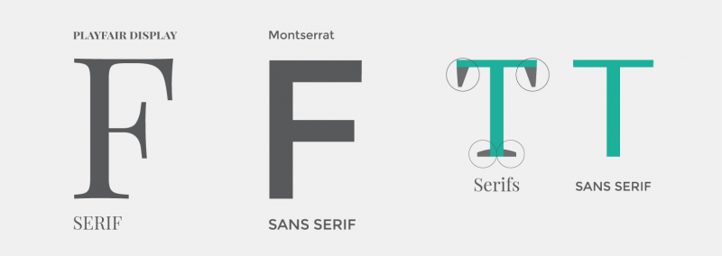
What are serif and Sans-serif?
Typography is the art of arranging letters and text in a way that makes the copy legible, clear, and visually appealing to the reader. It involves font style, appearance, and structure, which aims to elicit certain emotions and convey specific messages.
Serif and sans serif are two common typeface categories. Serif typefaces are recognized by the tiny lines that extend off of the letters and are used for long text. “Sans,” which is Latin for “without,” does not feature these small lines and has a modern look and feel.
How to use Typefaces:
Use only good and popular typefaces and play it safe.
It’s okay to use just one typeface per page! If you want more, limit to 2 typefaces.
We should choose the right typeface of serif and Sans-serif according to our website personality and keep trying different typefaces as we design and build our page.
After the selection of typefaces, we should also know how to use good font sizes and weights. For normal text, we can use font sizes between 16px and 32px, and for long text like blog posts, we can go with 20px or larger. And the most important part of a website i.e. headline size of 50px+ can be considered depending on personality.
Now if we consider the weight of the fonts it is advised not to use weights less than 400 because it becomes hard to read.
Good reading experience for users:
We all know to create a website that has engagement and satisfaction for users it is important that the reading experience should be good which leads to increased user retention, better user understanding, and a more positive perception of the website. So now let's learn how we can create a good reading experience for users:
We should use less than 75 characters per line which makes the text easy to read for the eyes.
For normal-sized text, we should use a line height between 1.5 and 2. (The smaller or longer the text, the larger the line height needs to be).
We can also decrease letter spacing in headlines if it looks unnatural. And for small titles, we can use uppercase along with making them small and bold.
Conclusion:
In conclusion, typography is an essential element of design and plays a crucial role in creating a visually appealing and legible website. Choosing the right typeface and font size, as well as font-weight, can significantly improve the reading experience for users. Good typography can lead to increased user engagement and satisfaction, better user understanding, and a more positive perception of the website. By adhering to guidelines such as using less than 75 characters per line and having a suitable line height, we can ensure that their website provides an enjoyable reading experience for their users.